
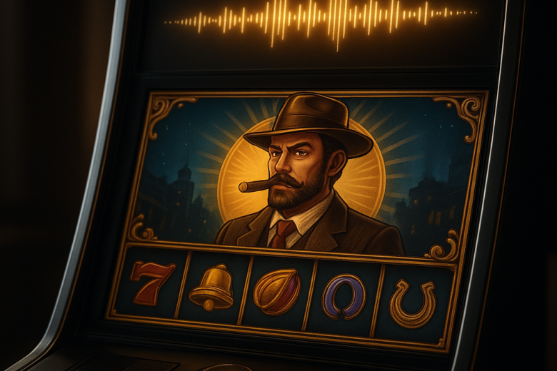
Sound, Illustration and Animation in the Identity of a Casino Game
Introduction
Casino games are often defined by their mechanics: the rules, the wager and the possible outcome. But players encounter a designed world before they learn how those systems work. A colour palette, sound cue or brief animation can set expectations for the experience ahead.
These elements are more than decoration. Sound, illustration and animation work together to make abstract mechanics clear and engaging. Each must support the same identity without competing for attention.
This offers a way to assess a game beyond its visual polish. Do its sensory details make the experience clearer and more coherent, or simply busier? In a format built around repeated actions and uncertain outcomes, the difference matters.
Analysing the creative line-up
Sound, illustration and animation each have a distinct role. Illustration defines the world, its symbols and visual hierarchy. Sound sets the tempo, while animation connects an action to its result.
Illustration shapes the first impression. Symbols, backgrounds and interface elements establish the game’s visual language, from the character of its world to the distinction between ordinary and special features. Strong art direction makes these choices feel connected. Without it, the screen can look like a collection of attractive but unrelated pieces.
The goal is not simply to make every object memorable. The artwork must remain clear at the scale and pace of play. If the background draws more attention than the symbols that convey information, atmosphere is getting in the way.
Sound is less visible, but often more immediate. A click, transition or musical phrase can confirm an input, signal a change or give a pause emotional weight. Used with restraint, sound makes the game feel responsive. Used too often, it can make routine actions demand constant attention.
Animation links visual and audio communication. It shows cause and effect: an object moves, a state changes, and the player can follow what happened. The most effective movement is not necessarily the most elaborate. It explains the result without making the player wait.
The relationship between these elements is the real test. A dramatic visual event paired with a muted cue may feel weightless; a loud flourish for a minor action may give it too much importance. When image, motion and sound agree on the significance of an event, the game feels cohesive rather than assembled.
Key factors
Hierarchy comes first. Players need to know where to look, what they can interact with and which changes matter. Illustration establishes that order; animation and sound can reinforce it during play.
Consistency matters just as much. A game may shift between screens or moods, but its symbols, colour logic and audio should still feel part of the same world. Consistency does not mean repetition. It means that variations remain recognisable as part of one design.
Restraint helps prevent sensory overload. Repetition is part of the format, so a cue that feels distinctive once may become tiring over time. Designers need to consider both its impact and duration, as well as players’ ability to reduce or disable sound.
Emotional tone also needs careful handling. A game can use playful illustration, cinematic movement or understated sound, but these choices should not suggest more certainty or significance than the mechanics support. Dramatic animation can make an outcome feel consequential; it cannot change what that outcome means.
Accessibility is part of the same conversation. Important information should not rely on colour, sound or motion alone. Clear visual states, legible labels and options for managing animation and audio help keep the game understandable and accessible.
Technical performance affects the creative result, too. Stuttering animation, delayed audio or visual feedback that obscures the next action can undermine the design. Polish is not only an artistic quality; it also means delivering the intended signals reliably.
The player’s match scenario
Imagine someone encountering a game for the first time. The opening screen sets expectations through its colours and composition. A brief sound establishes the tone, and a small movement draws attention to key elements. At this stage, the player is forming a mental picture of the experience.
Once play begins, the challenge is to balance clarity with distraction. Every input needs a clear response, but not every response needs to be a spectacle. If routine actions receive the same emphasis as meaningful changes, the game’s hierarchy becomes harder to follow.
During a longer session, endurance matters more than immediate impact. Repeated cues can become tiring, and lengthy animations can disrupt the rhythm of play. A well-judged identity offers variety without losing coherence and leaves room for the player to focus on the mechanics.
The closing moments show whether the creative system has held together. Transitions should remain clear, the visual language should stay consistent, and sound should support rather than dictate the player’s interpretation. The experience feels complete when its ending belongs to the same world as its opening.
Conclusion
Sound, illustration and animation are not finishing touches added separately to a casino game. Together, they form its expressive system: illustration establishes the world, sound gives it a voice, and animation makes its rules visible in motion.
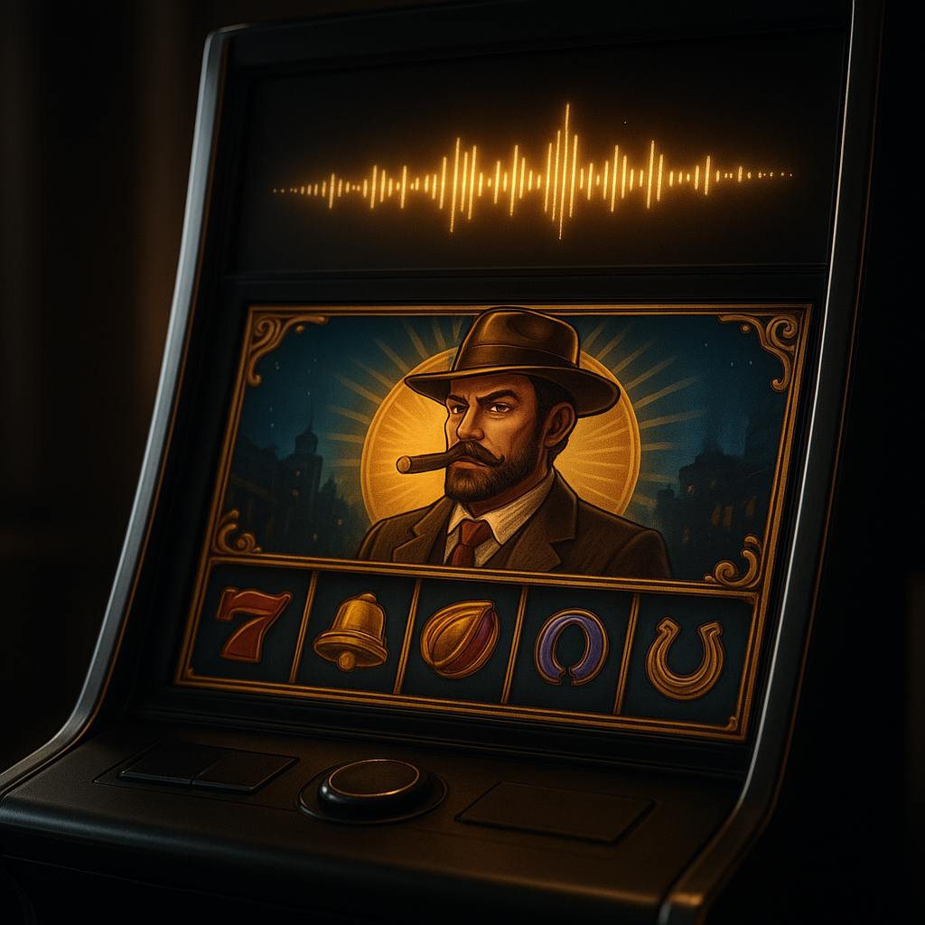
The strongest identity is not necessarily the loudest or most elaborate. It is one where every sensory choice has a clear purpose, supports the mechanics and respects the player’s attention. When these elements work together, the game becomes easier to understand and more distinctive without confusing atmosphere with substance.